Today, at the big 100 year anniversary shindig of the American Meteorological Society (AMS) there was a press release session that featured NOAA and NASA GISS talking about how their climate data says that the world in 2019 was the second warmest ever.
Here is their slideshow presentation, released today: https://www.ncdc.noaa.gov/sotc/briefings/20200115.pdf
In my opinion, the NOAA/NASA press release (and slideshow) is inconsistently presented. For example, they can’t even agree on a common base period for comparisons. Some graphs use 1951-1980 while others compare to 1981-2010 averages to create anomaly plots. NOAA and NASA owe it to the public to present climate data with a consistent climate period for comparison, otherwise it’s just sloppy science. NASA GISS has consistently resisted updating the 1951-1980 NASA GISS baseline period to the one NOAA and other datasets use, which is 1981-2010. GISS stubbornly refuses to change even though they have been repeatedly excoriated for keeping it.
That 1951-1980 period just so happens to be the coolest period in the 20th century, so by using that as a baseline, the peak amount of warming anomaly is magnified in NASA GISS plots. Most laymen will never spot this. A simple comparison of the two maps show the difference in the peak values:

Source: NASA GISS

Source: NOAA NCEI
The difference between the two analyses is NOAA @ 0.95°C/1.71 ° F and NASA GISS at 0.98 ° C/1.8 ° F
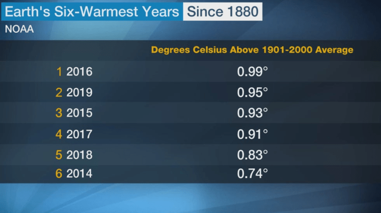
There isn’t much separation between some years at all:
One wonders if NOAA/NASA can accurately measure the Earth’s temperature with that sort of precision down to 1/100th of a degree. My experience suggests no.
Now lest you think I’m splitting hairs, bear in mind that during the last decade changeover, NASA declared this about 2009 and the 2000-2009 decade:
NASA Research Finds Last Decade was Warmest on Record, 2009 One of Warmest Years
… The past year was a small fraction of a degree cooler than 2005, the warmest on record, putting 2009 in a virtual tie with a cluster of other years –1998, 2002, 2003, 2006, and 2007 — for the second warmest on record. …
In the past three decades, the GISS surface temperature record shows an upward trend of about 0.36 degrees F (0.2 degrees C) per decade. In total, average global temperatures have increased by about 1.5 degrees F (0.8 degrees C) since 1880.
“That’s the important number to keep in mind,” said GISS climatologist Gavin Schmidt. “The difference between the second and sixth warmest years is trivial because the known uncertainty in the temperature measurement is larger than some of the differences between the warmest years.”
Source: https://www.nasa.gov/home/hqnews/2010/jan/HQ_10-017_Warmest_temps.html
So, small fractions of a degree matter when it comes to making climate claims.
But this year, Dr. Schmidt says:
“We crossed over into more than 2 degrees Fahrenheit warming territory in 2015 and we are unlikely to go back. This shows that what’s happening is persistent, not a fluke due to some weather phenomenon: we know that the long-term trends are being driven by the increasing levels of greenhouse gases in the atmosphere,” Schmidt said.
Source: https://www.nasa.gov/press-release/nasa-noaa-analyses-reveal-2019-second-warmest-year-on-record
So much for the concern about “uncertainty” and “trivial” differences in temperature. Interestingly, most people don’t know this but NASA GISS is not a truly independent analysis. They use GHCN data prepared by NOAA NCEI, the same data gets the NASS GISS “special sauce” and magicically come out a little bit warmer, allowing them to make the kinds of claims they make of “warmest ever” year after year.
While we are on that subject of datasets and small temperature differences, here is a bit of inconvenient data that never gets mentioned.
NOAA’s U.S. Climate Reference Network (USCRN) has the best quality climate data on the planet, yet it never gets mentioned in the NOAA/NASA press releases. Commissioned in 2005, it has the most accurate, unbiased, and un-adjusted data of any climate dataset.
The USCRN has no biases, and no need for adjustments, and in my opinion represents a ground truth for climate change.
In this graph of the contiguous United States updated for 2019 comes out about 0.75°F cooler than the start of the dataset in 2005:

Source: NOAA’s live online data plotter
The data show above was not plotted by me, nor adjusted in any way. It is entirely NOAA’s, and the fact that 2019 in the USA48 is cooler than 2005 is indisputable. The two large peaks are related to natural El Nino events which warmed not just the USA, but the world.
While the U.S. isn’t the world, and the dataset is shorter than the requisite 30 year period for climate data, the lack of warming in the contiguous United States since 2005 shown in the graph above suggests that the data NOAA and NASA use from the antiquated Global Historical Climate Network (GHCN) reflects warmer biases due to urbanization and adjustments to the data. I’ve demonstrated this with my own work here: https://wattsupwiththat.com/2015/12/17/press-release-agu15-the-quality-of-temperature-station-siting-matters-for-temperature-trends/
Imagine if the entire world had a high quality state of the art temperature monitoring network like the USA does. Arguments over data quality, adjustments, UHI, time of observation, and many other niggles which affect and bias the data would disappear.
But here’s also something interesting. All of the temperature plots used to represent climate change are highly magnified. This is so variations of one degree or less are highly visible. Unfortunately, these huge variation often scare the public since they perceive them as “massive” temperature increases.
Fortunately, the NOAA online plotter allows adjustment of the vertical axis, and when the vertical axis of the climate data is adjusted to fit the scale of human temperature experience, they look less alarming.
Here are some before and after examples, with the “after” plots set to the scale of human experiences with temperature, which typically range from around 0°F to 100°F. The zero mark on these anomaly plots assumes an average global temperature of about 58.4°F.
US Climate Reference Network:


Contiguous USA Climate Divisions (GHCN/COOP) Network (old style weather stations):

Source: NOAA online data plotter

NASA GISS for the world (Land and ocean temperature):

Source: NASA 2020 Press release

“Climate change” certainly looks a lot less scary when the temperature change is presented in the scale of human experience.